
Case Study
Marketing Mountain High:
The Alpine Outfitters Design Tale

Alpine Outfitters
Growing up in northern Utah, I remember Park City as a small mining town filled with broke ski bums in winter. I loved the busy, small ski shops there. However, the off-season can feel low-energy in the summer.
In this personal project, I envisioned what a small, locally owned establishment would do to promote their business in the summer months. While I was at it, I decided to develop a name and identity for the company as well.

Deliverables:
Identity design
Marketing collateral assets
I developed a persona based on a few people I know. Between 25 and 65 years of age, they cherish the great outdoors and take responsible wilderness stewardship seriously. I envision the company as a purveyor of high-quality new and used hiking, climbing, and camping equipment, serving those who live by the mantra of "take only photos and leave nothing but footprints.”

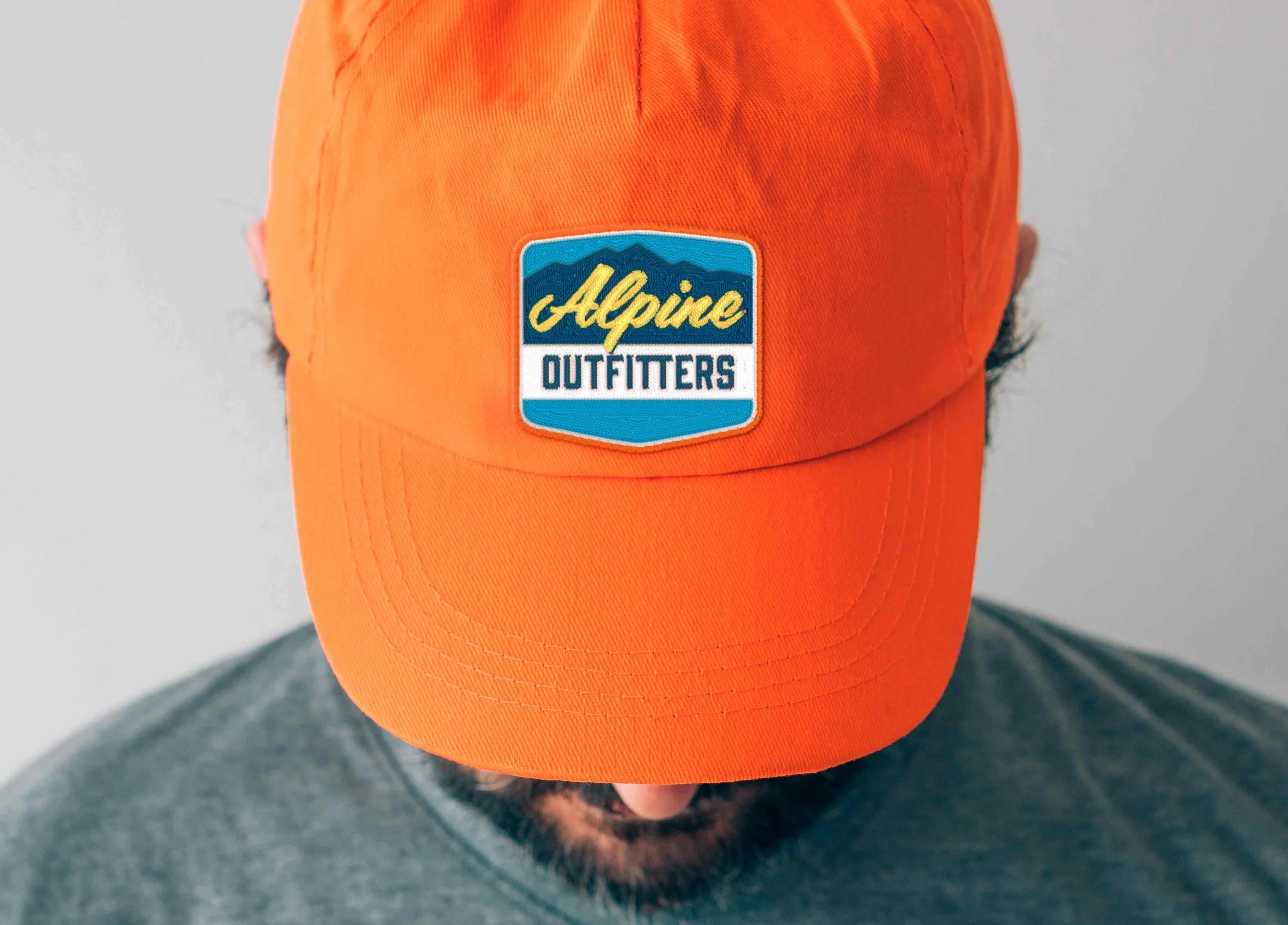
Inspired by a retro color palette, I eventually settled on deep teals and blues of a shaded pine forest, with the pop of a contrast orange or yellow hue.
Iterating through various design elements, I designed the logo and marketing collateral to embody what I envisioned as the brand voice: classic, utilitarian, and enriched with local history.
The color palette, logo, and design come together as a crafted marketing tool. This printed brochure is ready to establish a significant presence at local events and trade shows. It creates a lasting impression during face-to-face interactions with potential clients, customers, and partners.


These posters are another element that is a physical representation of the brand. Designed to create a lasting impression, they can be utilized as in-store displays and customer giveaways.

These digital ads seamlessly complement the print marketing efforts, reinforcing the messaging and creating a cohesive brand experience.
The Alpine Outfitters design enhances brand presence and fosters connections in the wilderness-loving community.